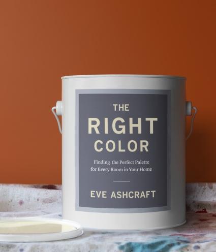
Recommended Reading: “The Right Color” by Eve Ashcraft
Colour is one of the most dramatic elements that you can change about your space. It’s also one of the most accessible, being inexpensive and non-destructive, and therefore an option for both renters and homeowners alike. Colour invites experimentation, with its promises of emotional expression, and yet it can also be problematic: one person’s serene is another person’s boring and what is bold to some is tacky to others. Culture, memory, and dreams all play a role in this deceptively simple exercise in home tailoring.
There are several great paint manufacturers, each with dozens if not hundreds of colours in their lines – it’s enough to give you a deer-in-the-headlights paralysis. Rules and pronouncements from experts abound to help you navigate the world of colour, but few guidebooks are willing to share enough information that you feel you can really navigate that wonderland for yourself. “The Right Color: Choosing the Perfect Palette for Every Room in Your Home” is one of those guidebooks, and of the many I’ve read, this was by far the most helpful.
Author Eve Ashcraft is not just a paint specialist. She’s the $275 an hour (in 2011) architectural colour consultant who not only chooses colours for the homes of movie stars and other such high rollers, but also designed a couple of Martha Stewart’s paint lines. Ashcraft now has her own signature line of colours from Fine Paints of Europe, called “Eve Ashcraft Color: The Essential Palette”. It has just 24 colours, each designed to play well with the others and allow for a range of effects.
The great thing about this book is not that it outlines a process (which it does) but that she teaches you to be brave about colour, and gets you to start experimenting independently and really having fun. “I believe that you can use any colour anywhere, so long as you use the right dose,” she says. While she loves white, saying “It’s very effective at brightening a dark space and unifying disparate elements”, Ashcraft encourages you to think more strategically and non-traditionally about colour, and to choose colours that work with the space, the furnishings and other décor elements that will inhabit it, and most importantly your goals and ideas.
Colour inspiration can come from anywhere: a favourite object, artwork, fabric, your favourite colour, a scrap of gift wrap, anything. From there the process of translating the colour to something that will work well on your walls will involve some thought, as just a straight-up colour match may end up giving you something that blows you away when there’s a lot of it on a wall. Finding the version of your colour that will work well with the floor, the furnishings, and the mood you want is a path Ashcraft teaches you to walk with assurance and skill.
Breaking the Rules (or Not) the Right Way, For the Right Reasons
“The Right Colour” just overflows with excitement and ideas. After providing some gorgeous examples of using colour to accomplish specific effects in a space, the author talks about how to break the established rules to great effect. But the author isn’t a knee-jerk iconoclast with a teenager’s bedroom approach to colour. There are also times when you stick with a more traditional approach – intentionally; it all depends on what you’re trying to do. Here’s a taste of Ashcraft’s advice:
- On why architects and art galleries cling to white: “Ironically, the prevalence of white in Western architecture has its roots in the mistaken belief that the ancient Greeks lived in a pristine and formal world of bleached marble. Even after it was discovered that Athens looked a lot more like Las Vegas than a bright white architectural model, countless minds could not be swayed.”
- On painting ceilings a dramatic colour: “There is no rule that says that ceilings have to be white, though that is often the appropriate choice. If I’ve put a distinct colour on the walls and want them to be the focal point, I’ll keep the ceiling light…Putting colour on the ceilings is one more thing to figure out, but it can be worth the extra effort. Because it’s unexpected, it’s a pick-me-up, psychologically and visually.”
- On latitude and colour: “The sun was so intense and omnipresent that colors I considered bold back home grew positively pallid in the Caribbean sun…There’s a good reason you don’t see hot-pink bungalows amid the weathered gray cottages of Nantucket.”
- On going with a dark colour in a small space: “A small white room may seem dreary despite the conventional wisdom that says small rooms must be light. Paint that same small space cocoa brown and it radiates appeal, becoming the coziest nest ever.”
- On using the same colour on everything: “Painting the trim the same colour as the walls is a powerful way to simplify and modernize older styles of architecture.”
- On finding the right white: “…Search for clues in fabrics, art, and objects in your room…When I was renovating my apartment bathroom, I had a hard time selecting a wall colour because I was fixated on the creamy hue of the subway tile. Nothing worked until I started looking at slightly deeper whites – colors that were closer to the grout.”
Always Field Test Your Colours
One of the best pieces of advice Ashcraft gives is to test the colours on their final location. Try as paint manufacturers might, they can’t print perfect samples, and they’re never exactly the same as the actual paint. Added to that is the complexity of colours in the actual location – what’s outside will influence what’s inside. In the end, colour is about light, because any colour will look different depending on the lighting. Even with natural light there is variation; the same colour looks different in different parts of the same house, depending on the amount of daylight and the time of day and the exposure, so in the end you have to test it right on the wall it’s going to be used on.
Buying a few test pots and trying out your colours makes sense – if a colour is a disaster once it dries, there will need to be more time and money spent to repaint. It’s better to take an afternoon or two to experiment with the final candidates than to be sorry – it’s a trick that has helped me choose colours I am still happy with.
The End is the Beginning
“The Right Colour” is empowering, because it gives you the knowledge you need to weigh opposing factors and pick colours that are effective. An endless experimenter with colour both in her own and her clients’ spaces, Eve Ashcraft shares in this book the wealth of knowledge that her experience has given her. Filled with hundreds of beautiful photos to illustrate the principles Ashcraft discusses, and friendly, funny prose, “The Right Colour” is as enjoyable to read as it is helpful.
You pick the goal – with the advice in “The Right Colour”, you can get there.
by Jennifer Priest
Follow me on Google +
No comments yet.
Add your comment