When More is More: Layering Case Study
 Mies van der Rohe famously said “less is more”, and for the past ten years this statement has been the lodestone in my quest to overcome my inner pack rat and adopt a minimalist aesthetic. I have been working on reducing purchases, organizing and storing objects, and just plain editing like crazy. After all, when there’s less to look at, there’s more negative space to shape, and more room for your imagination to play.
But could I be wrong? Maybe for a minimalist style to work, the house has to have superb architecture that’s meant for lots of exposed surfaces. Maybe I’ve been looking for the great bones of a fashion model in a house that’s shaped more like a plain Jane. Maybe my house needs to dress up a little more.
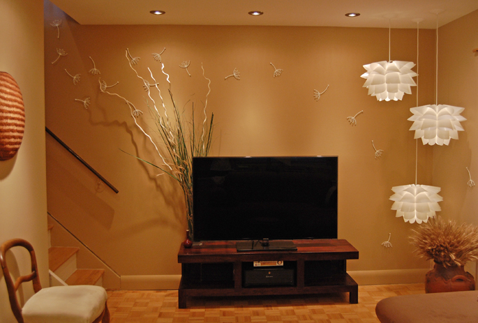
A recent décor addition has brought this issue to light for me. When we renovated our living room, I was careful about not adding a lot of clutter. Everything had to have lots of breathing room – especially considering how tiny the room was. To add a sense of movement to the room, I had added some Umbra “Pluff” wall decor, painted to match the ceiling colour, and I thought that would be more than enough decoration. Over the past year, however, my husband has been feeling that there needed to be something more on the media console; something to balance out the arrangement of light fixtures on the right.
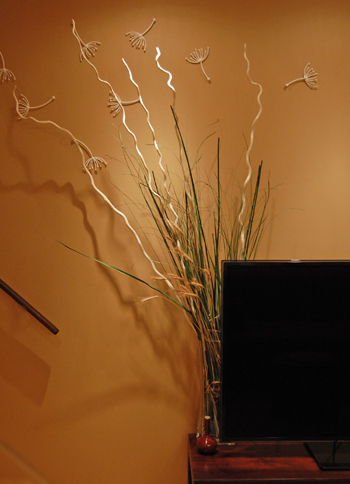
So, we added a plant there as a temporary test, and the strong green added a bit more vibrancy to the room. It also added an unexpected depth, and reinforced the “autumn grass” theme I had chosen. It would have been great to be able to keep the plant, but the insufficient light would have eventually killed it. A quick trip to Ikea and about $45 dollars later, and we had a dry grass and twig arrangement set up behind the screen.
A simple dry grass arrangement completely balances the light fixture and adds more fullness to the room – but in a good way.
Wow! Big transformation! The cream coloured branches played beautifully in the directional spotlights, and cast some lovely shadows that looked like a field. Having another layer of objects behind the screen also provides a reference point for the eye, and actually expands the room. It certainly adds richness and texture to the area. In short, it brought the story the room was telling to life.
While I don’t plan to abandon my pursuit of living more chicly by living with less, but – just maybe – sometimes more actually is more.
What do you think? Do you like the addition, or do you prefer the old version? Do you have any thoughts on layering objects in a décor scheme?

Northwest View
By Jennifer Priest
Follow me on Google +
No comments yet.
Add your comment