Let There Be Light! Part 5: Serengeti Toffee Pumpkin Mocha Bisque – The Rabbit Hole of Choosing Paint Colours
 Colour is a powerful emotional engine. It can uplift us when we’re feeling down, it can soothe and relax, it can inflame passions, and it can chase us out of a room entirely. Depending on who we are and our emotional backgrounds, different people react to colours differently. A colour that can energize one person will make another feel agitated; what relaxes one person might bore another. We are looking to colour to help balance things out for us, it seems, when it comes to choosing the colours that become the backdrop for our lives. This is why choosing a colour for a space is such a big decision, and one that should be considered carefully.
There are dozens of magazines, books, and online articles offering advice on how to choose the right colour – I think I’ve read most if not all of them! The best piece of advice I can offer is to take your time in choosing your colour scheme. Colour is not a simple thing and it can have a profound effect on your space. On the upside, painting is not an expensive renovation project, and if for some reason it’s a disaster, it’s a weekend fix for most spaces.
“Have you noticed that all these paint colours are named after food?” commented Justin as he observed my latest session of paint swatch madness. I was in the middle of the hallway, surrounded by a fortress of small scraps of colour. “Hmm,” I answered, “must be why I like them”.
I spent almost 2 months choosing my paint colours, but it was worth it because I love the final result. This process is slightly different from processes outlined in articles articles and books that assume you can replace everything in the room. A complete overhaul from top to bottom just wasn’t in my budget. Instead, I worked with the things I couldn’t change, and built around them. The process below, therefore, includes more than just paint colours: it includes the colours and textures of everything in the room. Here’s how I did it:
-

Larger test patches allow you to recompare the essential elements in your decorating scheme to the colours. Stepping back to view from a distance is a big help – the bucket and table hold my couch fabric and fabric art at the right height.
Consider what elements are not changing. Examples can include floor colour, pricier furniture pieces, favourite art objects. Write these down in a list so they are not forgotten, or take pictures of them.
- Consider the shape and architectural elements of the room. Colour can have different effects – darker and warmer colours can advance, cooler and lighter colours retreat. I wanted to do a slightly darker accent wall to help balance the proportions of a long, narrow room, and make it feel more square.
- Come up with a unifying theme. This can be difficult, but it will really help you make detailed decisions based on whether it supports the theme or not. I have seen rooms that have a lot of great stuff in them but don’t really come together well because there’s nothing to connect the different things in the room.
- Consider the look you have, and think about what you like and don’t like about it. How does the room make you feel when you’re in it? How do you want it to make you feel? Write out random ideas, make doodles, and keep your notes as you go through the process. I knew I was looking for warmth and shelter, but balanced with some stimulation. I was hoping the final room would give me a mood of energized peace, like taking a walk in a natural area early in the morning.
- Look at images you find inspiring – but here’s the trick – the images can have nothing to do with interiors. I looked at nature images, but other ideas include fashion, art, portraits of inspiring people, or anything you love. Collect about 20 or so.
- Review the images and identify anything they have in common – this can abstract or concrete. It can be a colour, a shape, a pattern – anything. A friend can help. In looking through my collection of images, I was surprised to learn that almost every image involved long grass in one way or another. When I considered that there were also a lot of autumn and sunset colours in the collection, I decided on a theme I called “autumn grasses”.
- When you’re evaluating your images, you may want to look back at your collection of essential elements in your décor scheme that aren’t changing. If you’re seeing a couple of themes in your abstract inspiration, you may want to make a choice based on how they work with these things. For example, you may have an ebony hardwood floor that doesn’t necessarily harmonize with your pastel tea party images – maybe that’s a sign to let go of the tea party idea and remove these images from the collection. On the other hand you may be able to find creative ways to balance the sober, masculine floor with the girlishness of the pastels- there’s a lot of room for different approaches and takes on themes.
- Develop an inspiration board. This can be the classic display of inspiration image, fabrics, woods, and images of your objects that you’ll be working with; mine was partially electronic, and partially real, and much more informal. If you have trouble visualizing things, I would recommend doing up an actual board.
- An important part of developing an inspiration board is editing, in my opinion. Sometimes there are painful decisions to make as things have to come out because they don’t work with the theme. I left my theme pretty loose – not everything is exactly about autumn grasses per se – sometimes the colour was the tie in, or a shape. The point is that not every object has to strictly and blatantly adhere to the theme – loosen things up so the theme doesn’t beat you over the head.
- While you’re doing your board, consider how much contrast you are comfortable with in your décor scheme. Some people want low contrast: similar hues and tones that they find relaxing. Others want dramatic opposites. Learning about what level of contrast you like will help you in the next few steps, when it comes to picking the colour or colours that will bring your theme together.
- Make an initial colour direction choice, and acquire swatches. Don’t forget to go outside of your comfort zone a bit – get wilder colours and quieter ones, fully saturated colours as well as muter, greyish tones. You’ll need a variety for comparison – the more the better.
-

Taping swatches to a wall allows you to evaulate their compatability with your decor elements.
Evaluate the swatches in the location they are to be used
- Evaluating under different lighting conditions is key. First look at how the colour behaves in the location at different times of day. At night, when the lighting is artificial, look again. Different sub-tones in the colour are accentuated by the different colour temperatures in the light. Use the lights that will exist in the room when it’s done, but if possible also buy different light bulbs that you could use instead and see if that changes things.
- Evaluate the swatches with your essential objects in mind. I have a very yellow oak floor, and a pinky-tan couch, neither of which I can afford to change right now. I also have an African fabric hanging with lots or orange, cerise, and indigo that I love too much to store away. Balancing these elements with my theme was very tricky. In her book “Style”, Kelly Hoppen says, “There is a pinkiness in taupe that fights with the yellow in sand. You will never make them friends, so don’t waste your time trying.” She was definitely right about that, but I was forced to try and make my sandy floor and taupe-y couch try and play well together, and I was counting on the autumn theme and my paint colour to go well with both, thereby pulling everything together. I was hoping that if I could find colours with enough yellow AND red in both, then it might work.
- Don’t forget to consider how the finish may change the look of the colour. I knew I wanted a very flat finish, which would match the swatch, but glossier finishes will appear slightly lighter than the swatch in real conditions.
-
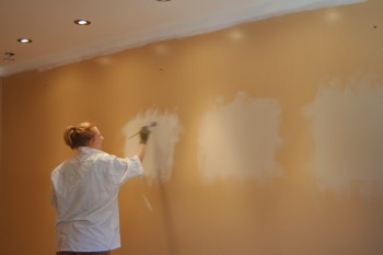
To make my final choice between three close contenders, I painted test patches on the wall so I could get a better idea of the colour’s full effect.
Finalize your colour choice by painting test swatches. Paint stores will sell you tiny test-pots that contain enough paint so that you can cover a section of wall or a piece of Bristol board. I painted on the walls, but if you are trying to choose one colour for an entire house, you may want to consider the Bristol board option, so that you can carry it from room to room.
- Re-evaluate until you are 100% confident about your choice. Listen to your doubts and consider second opinions. I thought I had a great colour, a soft grey that would make my accent wall and my furniture pop. My mother hated it, so I started over from scratch, getting out all my swatches again, open to the idea that I might still pick my favourite, or I might end up with something else. I’m glad I did: I ended up with a much warmer tone that helps unite the room. Over time, I realized that my initial pick emphasized some pinkish tones in the tan colour of my couch that I disliked (oh, how I wished I had the money to re-cover that couch!).
The best advice I can give in the end is to take your time. Read voraciously, because there are a lot of talented designers who have written extensively on how colour works in an interior décor scheme. If you need to, put your swatches away for a couple of weeks, and then bring them out again so you can see them with fresh eyes. I got some teasing about how long I was taking to make up my mind, but now that the colours are on the walls and I’m still happy with them, no one can say that the time was wasted. My final colour choices? Both are food names, of course: Behr’s “Renoir Bisque” for three walls of the room, and “Peanut Butter” (also from Behr) for the accent wall.
Next Post: How to convert plug-in lights to hanging lights.
By Jennifer Priest
Follow me on Google +
No comments yet.
Add your comment