Colour and Other Strategies for Small Spaces
In a small home or a small room, the challenge in using colour is to create a space that doesn’t make you feel like you’re living in a shoebox. With the rise of the downtown condo there has been more focus on small space living advice. I’ve noticed that a lot of the advice is consistent amongst designers, whether in books, in magazines or online. Here is a summary of what I’ve learned over the years, in one convenient package!
The first thing you need to decide is if you care about making the space seem larger or not. For some, funky style and visual stimulation trumps spaciousness every time. For others, a more airy and restful oasis is the goal. The colour strategy you choose must serve the overall mood you want to create.
Walls and Ceilings
Stay Light and Bright
Most designers agree that keeping wall and ceiling colours pale will help to visually expand a room. White or near white materials will reflect more light, and bounce it around the room, making surfaces recede. Glossy finishes (especially on the ceiling) will do the same thing, but may look a bit too futuristic for some tastes. Because the eye is drawn to contrast, any darker item in a lighter colour scheme will seem to come towards you.
A ceiling that is paler than the walls will usually makes the room seem taller, but the effect can draw the eye too much (for my taste) if the contrast between the two colours is too obvious.
…Unless You Go Dark
If your entire colour scheme is darker, it can feel delightfully cozy. Remember that in a dark space, the rules will reverse, and anything lighter will come towards you, and darker items will recede.
The key thing to remember that darker colours will absorb more light, so when even evening falls you’ll need a more intense lighting scheme to bring your space to life.
Go Monochromatic
One principle that most designers agree on is that whether you do dark or light, vivid or neutral, if your goal is to make your place seem larger, a consistent colour scheme will open things up. Every time a change happens, a line is created that will stop the gaze as the eye travels around a room. When the eye can flow effortlessly around a room, the space seems larger.
I’ve seen many layouts where the designer makes a multi- coloured palette work in a small space by using all-vivid colours. Because there are so many different blues, greens, reds, oranges and yellows all vying for attention, the eye doesn’t really stop. The key is to use the same level of saturation for the different colours, and don’t make any one area of colour too large. This kind of design stuntwork can be tricky, however, and may be best left to advanced designers.
…Unless You Don’t
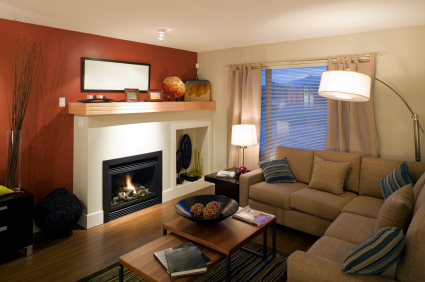
This accent wall shows how white advances when set against a dark background, and how a dark wall will optically advance when set against a colour scheme that is pale overall.
Even in a small space, you can have fun with contrasting colours by creating an accent wall. If a pale, neutral palette is too boring for you, try an accent wall in a vibrant colour. Remember, if everything else is pale, the accent wall will come towards you, so make sure you choose a wall that you want to bring closer. This technique can help if you have proportions that are awkward that you want to correct. For example, if you have a long narrow room and you want to bring the far wall closer, that’s the wall that gets the accent colour. And hey, if it doesn’t work, it’s just one wall, so it’s an easy fix.
Flooring
Again, pale materials will bounce light back, dark ones suck it up. When there is a transition in colour, the gaze of the eye will be halted. When choosing a floor colour, remember that it is much more difficult to change than paint, so make sure you test with swatches under all lighting conditions.
Dark Floors
Dark floors will provide excellent visual grounding for your room design, and will connect your furnishings to the floor in a very obvious way. Deeper hues can be comforting, because they say “traditional”.
Pale Floors
Pale floors are airy, and can make furnishings seem to float. For some, the effect can be disorienting, but if your walls and furnishings and pale too, it can be pleasantly airy.
Other Consistently Recommended Techniques
- Living in a small space can feel confining unless you adapt, and making a small space work for you involves more than just your colour palette. The following principles show up over and over again in designer recommendations for small spaces.
- When choosing furnishings, pick one oversize accent piece, and then scale everything else down as much as possible.
- Clean house with a hatchet. Be ruthless with possessions you don’t need and give away anything that you don’t use regularly. Do without where possible, and if you fall in love with some piece you see while shopping, remember that it will have to be stored somewhere. For example, if your place is 500 square feet, do you really need an everyday set of dishes, plus a second set for occasions? Simplify as much as you can so that you don’t have a lot of objects cluttering up your space. To keep my inner shopaholic on the leash, I use the following rule: every time I buy something, something else of the same volume has to go. This changes the shopping focus from “I want it!” to “Which of my old friends has to go?”
- Choose furnishings that allow you to see the space behind them. Whether made of a transparent material or a leggy design, when you can see beyond an object, the eye is fooled into thinking the space is larger. Save objects with a constant connection to the ground for those with the room for them.
- Make sure you leave plenty of traffic space between objects. If you’re constantly bumping into things, you will definitely feel crowded.
- Use large expanses of mirror to visually expand space. A small mirror will look like a mirror; a large one covering an entire wall will look like another room.
by Jennifer Priest
Follow me on Google +
Pingback: Decorator, Designer, and Architect: Differences for DIYers » housecraft()